Branding
Logo
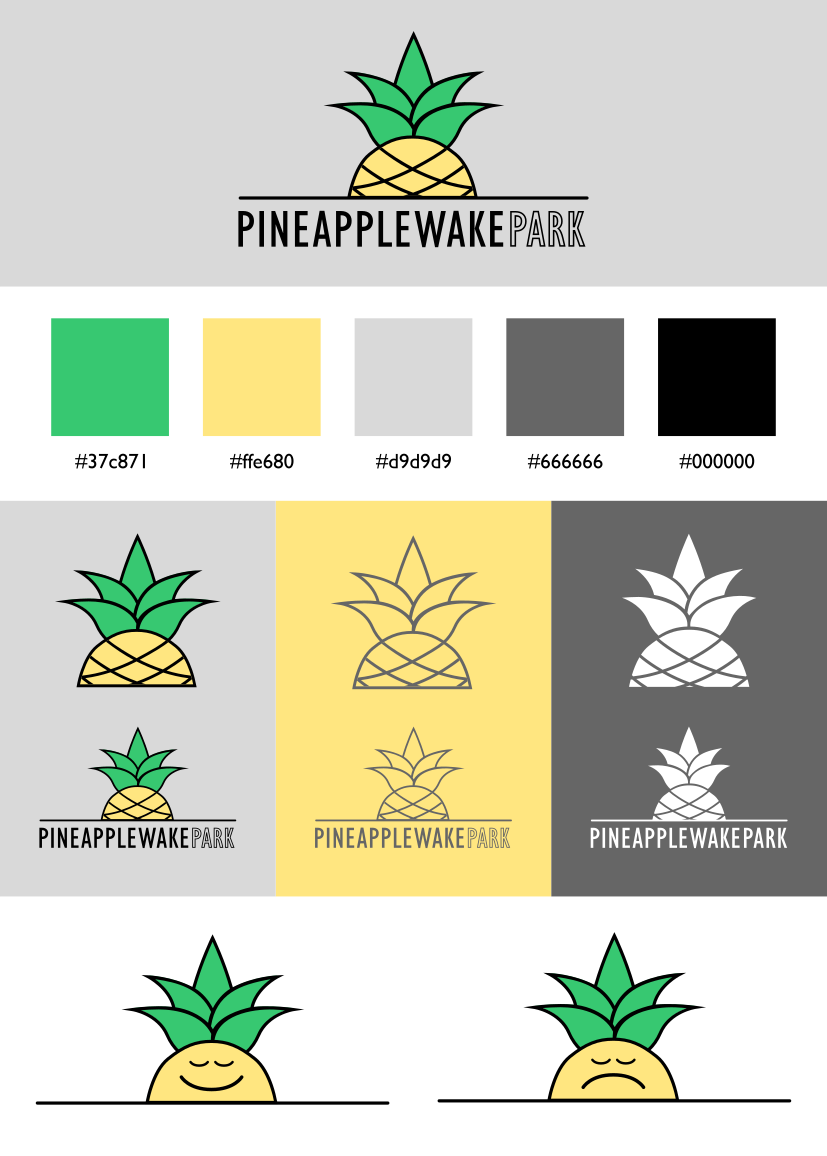
The pineapple was an accompanying symbol from the beginning, which led to the naming when the idea of organizing wakeboard camps and eventually running their own wake park was born. Therefore it was obvious to also integrate the fruit into the logo to create a high recognition value.
Word and figurative mark consist of a pineapple and the lettering "Pineapplewakepark" to form the logo of the wake park.
The design deliberately focuses on clean lines and geometric shapes to represent the modern, sporty character of the company.
The colors of the pineapple were chosen to harmonize well but still catch the eye while not being too garish. This allows the use in all media to embody the CI by using the logo colors for fonts and backgrounds.
The logo can also be used as a pure silhouette, both positive and negative, on all substrates.
For displaying news on their homepage or social media the pineapple even has two moods to show.
Menu
Both digitally and in print, I was able to support Pineapplewakepark with my graphic design skills.
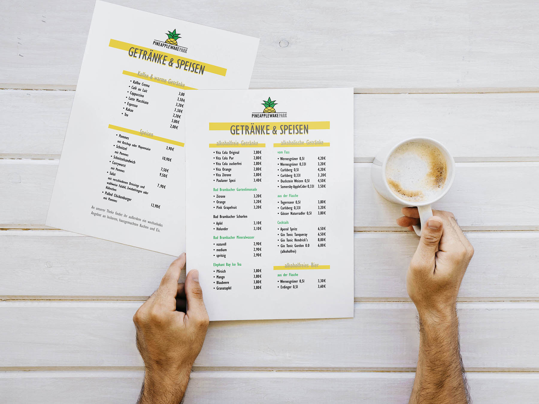
The corporate identity of Pineapplewakepark is also reflected in the print menu of their restaurant.
For the rather small selection of food and beverages in the seasonal business, it made sense to design a double-sided menu that could later be used in laminated form at any time, protected from wet wakeboarder's hands or greasy french fry fingers. The colors of the logo and the reuse of font elements create a balanced overall image that does justice to the CI.
The menu is also available for download as a digital version on the wake park's homepage.
Voucher
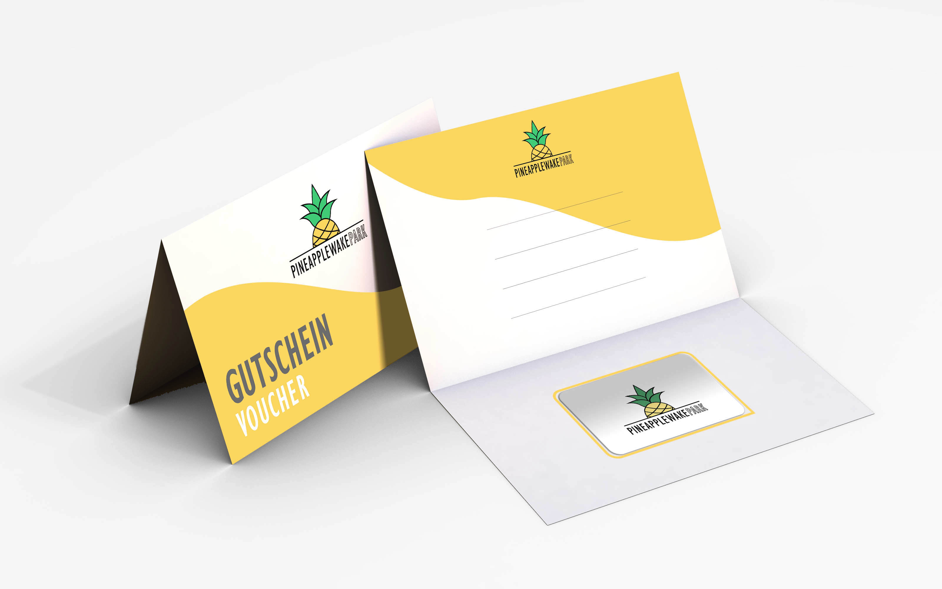
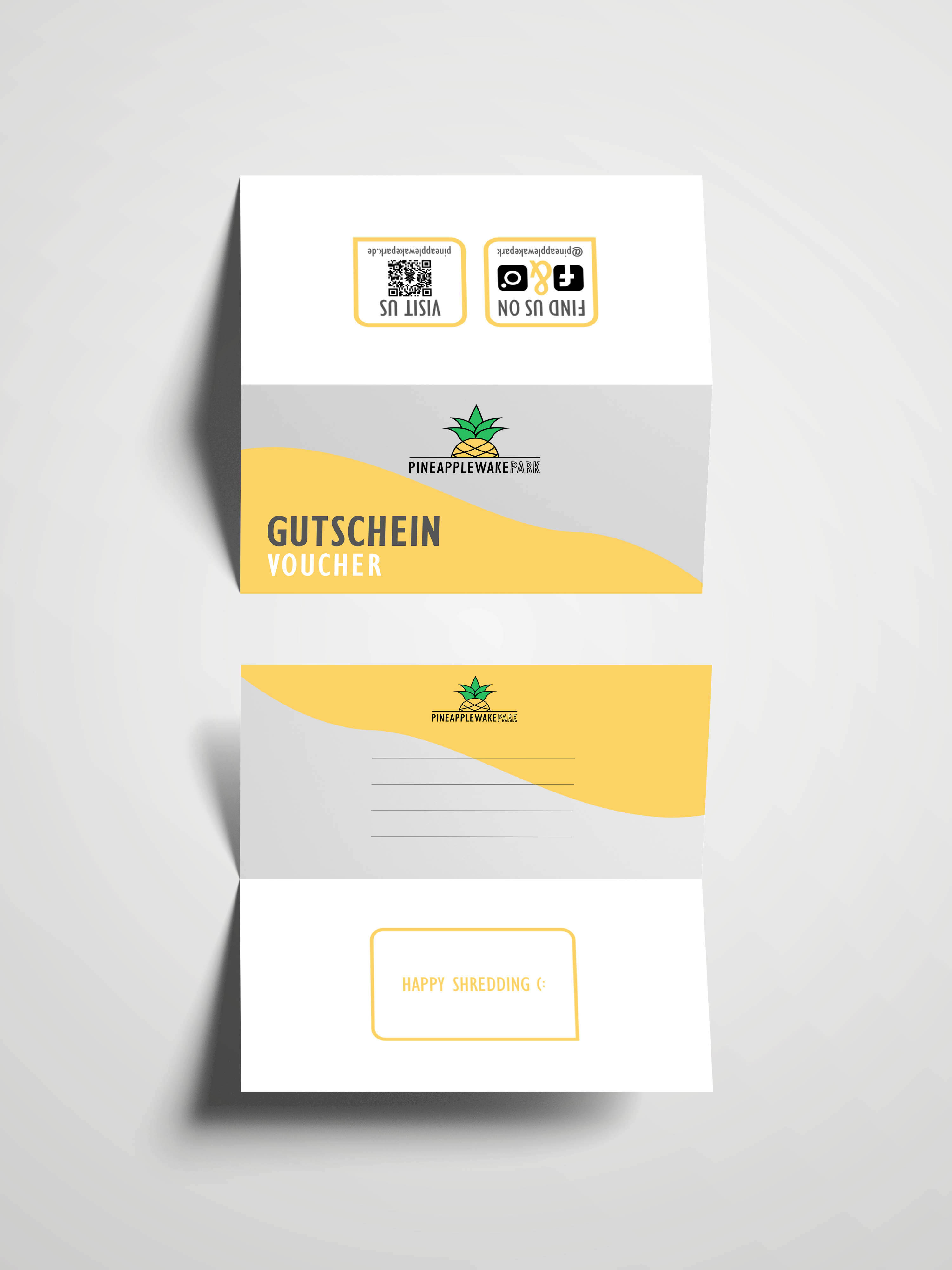
A voucher should also allow guests to purchase credit that can be redeemed throughout the facility. For this purpose, customers can purchase a prepaid gift-card with their desired value.
According to this scenario I designed a visually appealing folding card in which the prepaid card is kept and customers have the possibility to insert a personal message.
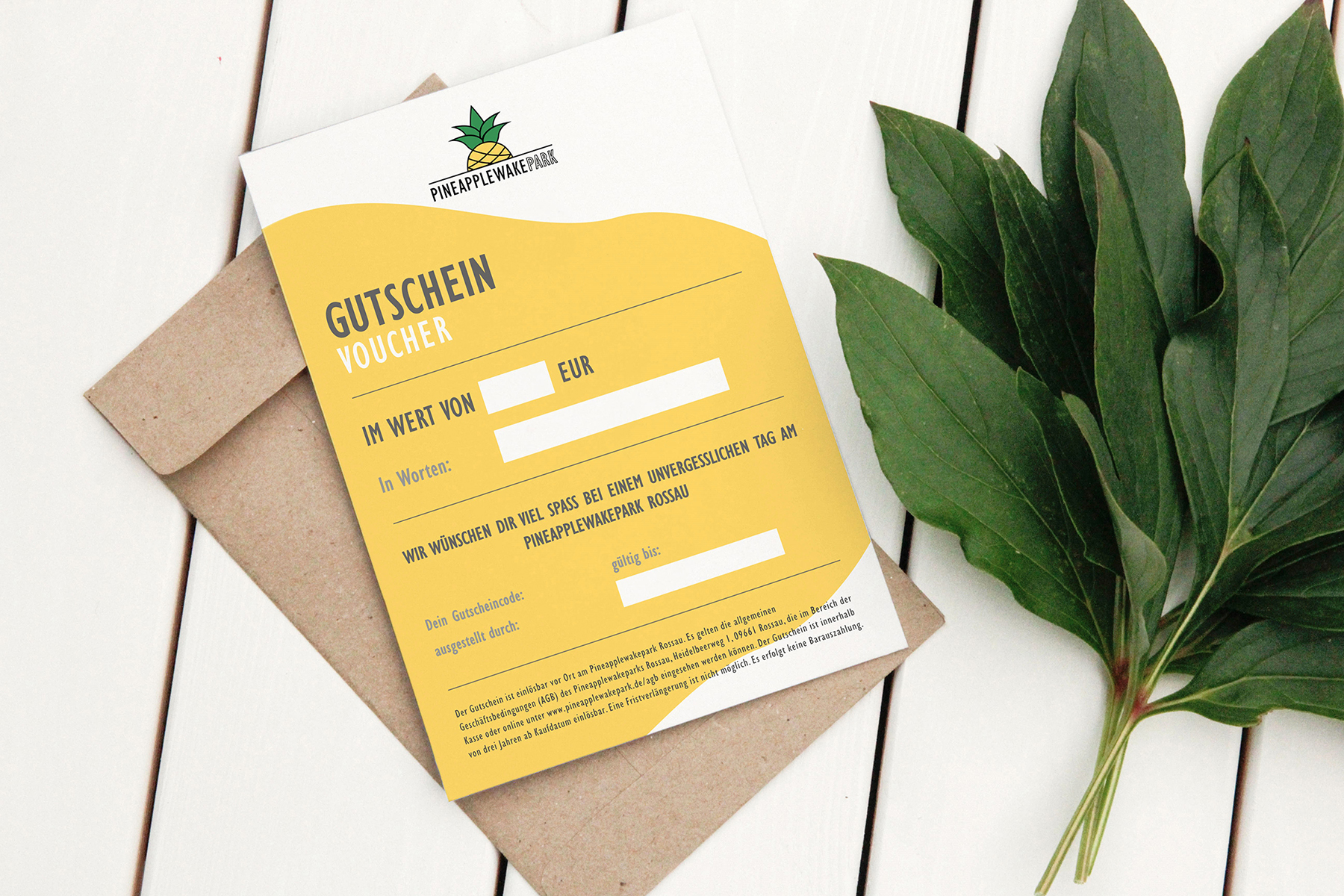
When buying a voucher online, customers receive a print-at-home version of the voucher.
Therefore the optional design follows a full page format and has predefined blocks to be filled by the stuff or automatically via software with code generation.
Flyer
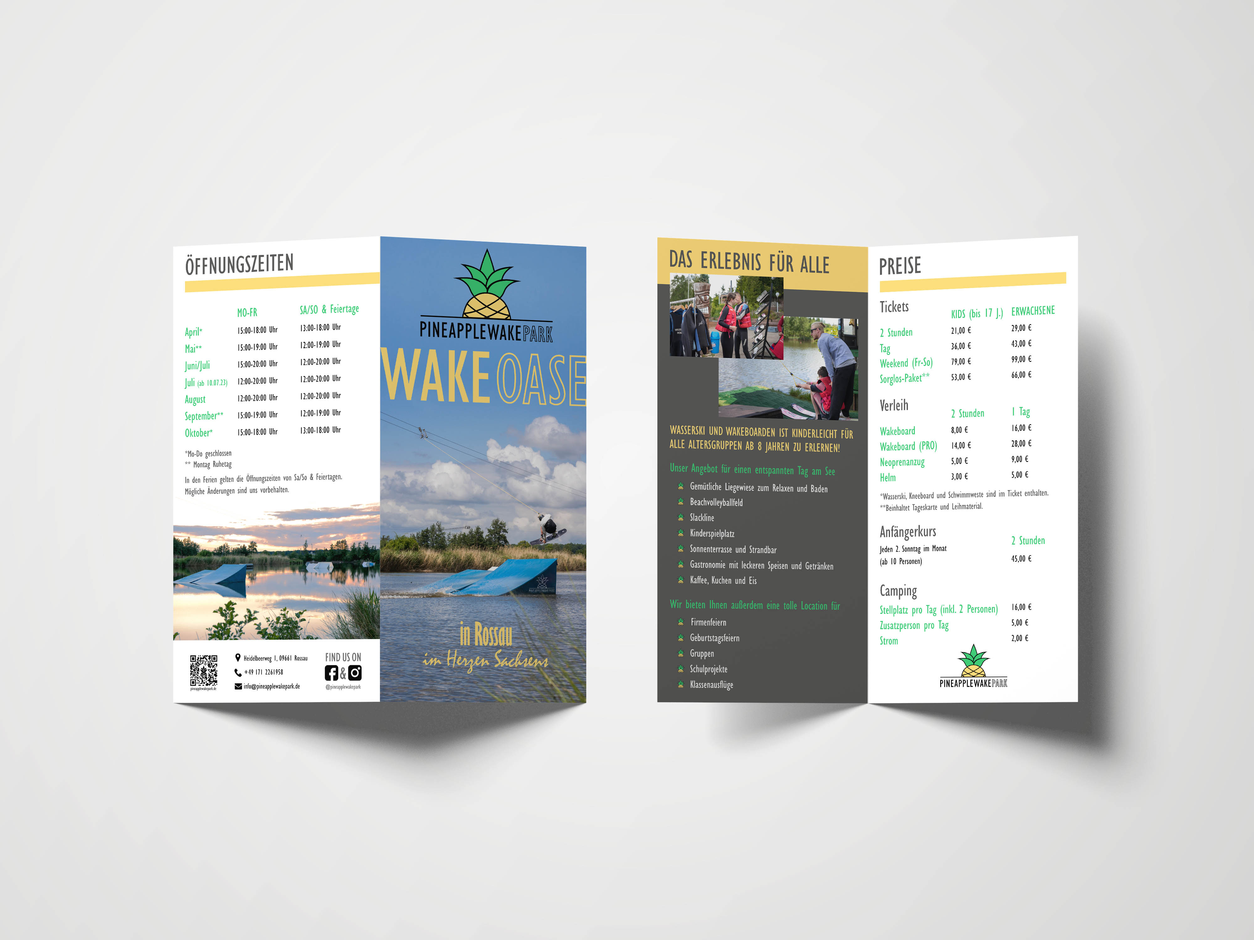
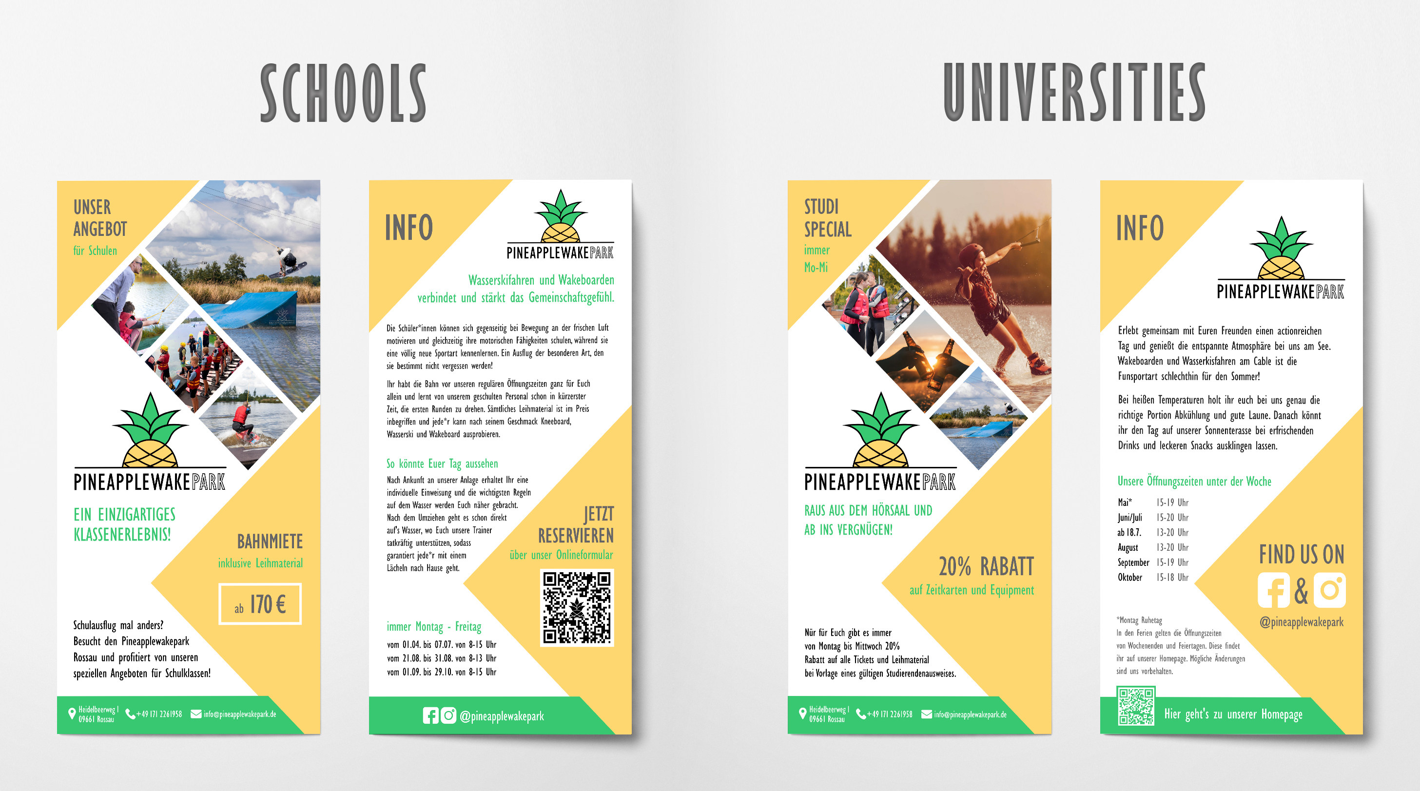
As an overview brochure, which gives the guests a quick look at the entire offer of the wake park and all the background information, it was also necessary to design a flyer.
For this, I traveled to the customer to take photos of the facility, the riders and the park first. These were then used in the flyer to give new customers an idea of what to expect at Pineapplewakepark Rossau.
The design is again based entirely on the CI of the wake park and picks up on the formal language, typography and color scheme of the logo.
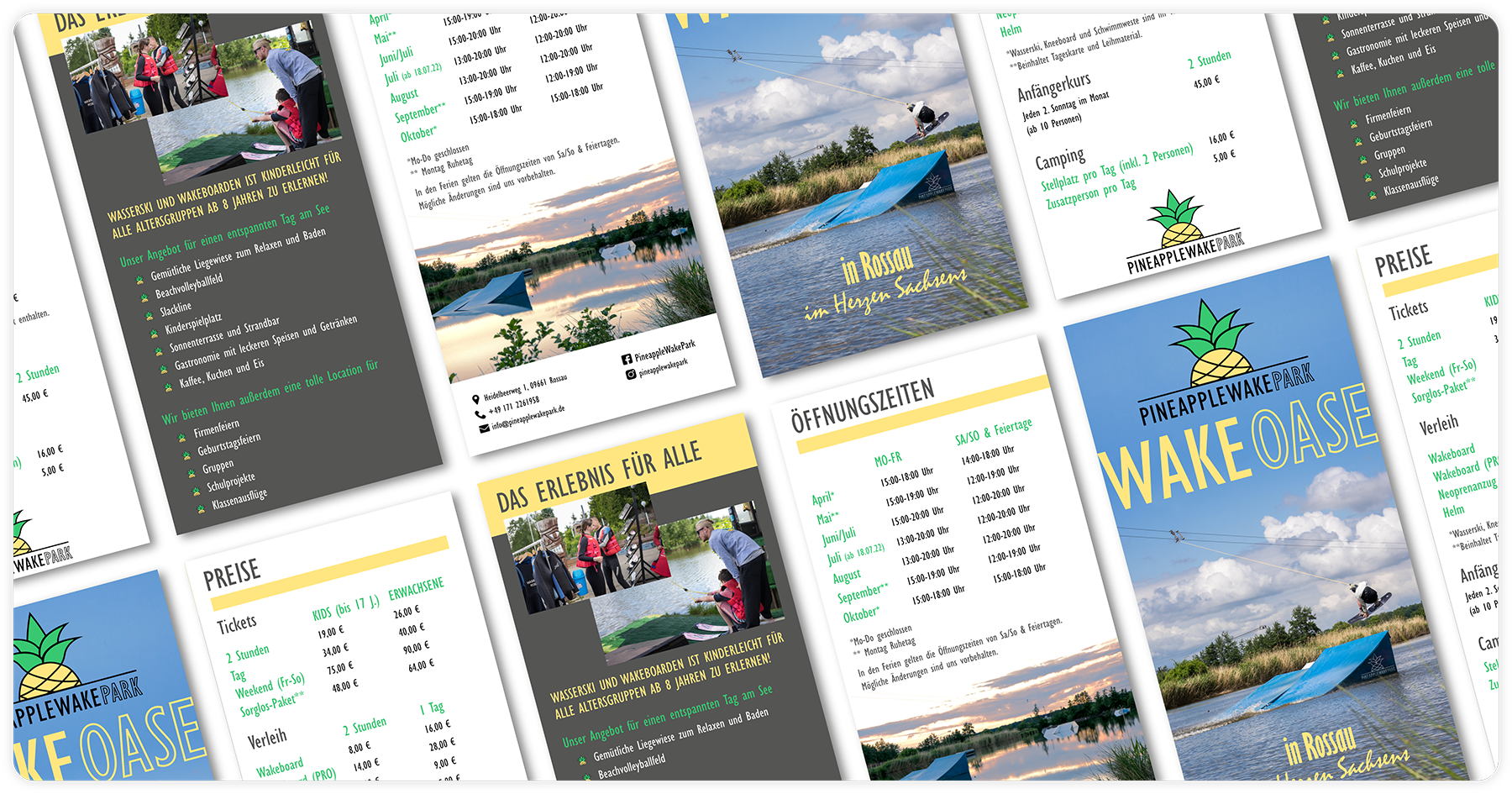
In order to generate customers in the younger target group as well, two additional flyers were designed for schools and universities. These are intended to appeal to people in these two age groups, particularly through the playful layout and visual language.
Since it is in contrast to the informational brochure about the parks offers mentioned above, it comes as a more volatile medium which was decided to be a two-page format, with an information overview relevant to the target group.
Web
Homepage
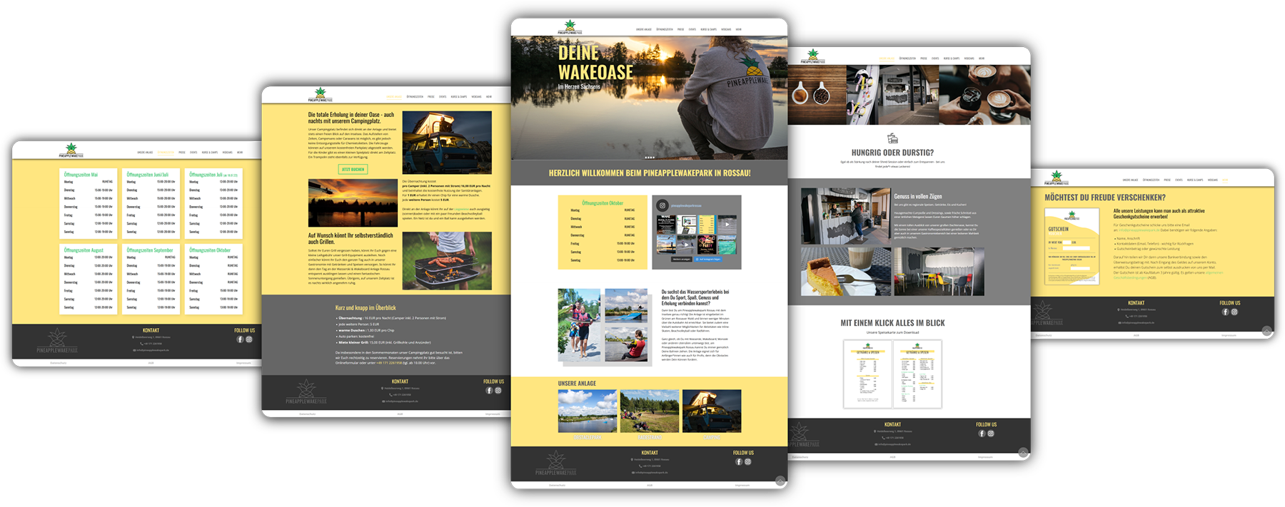
Finally, the wakepark also needed a website, whose design and implementation was entrusted to me. Through a clear menu structure and design, it should be possible for customers to quickly grasp all the information and get to know the entire range of services offered by the wake park.
Since Pineapplewakepark had to accommodate a relatively large selection of activities and information on the homepage, the design of the layout was based on a goal-oriented division with a globally available navigation bar that makes all information accessible at any time and from anywhere.
In line with the CI, a clear design language and modern typography were also used here. For the benefit of the user experience, discreet scrolling animations form an eye-catcher when visiting the site.
The website is Wordpress-based in order to offer the customer a simple way to enter information themselves via the content management system and thus to be able to react quickly at any time to circumstances such as changes in opening hours.
Desktop
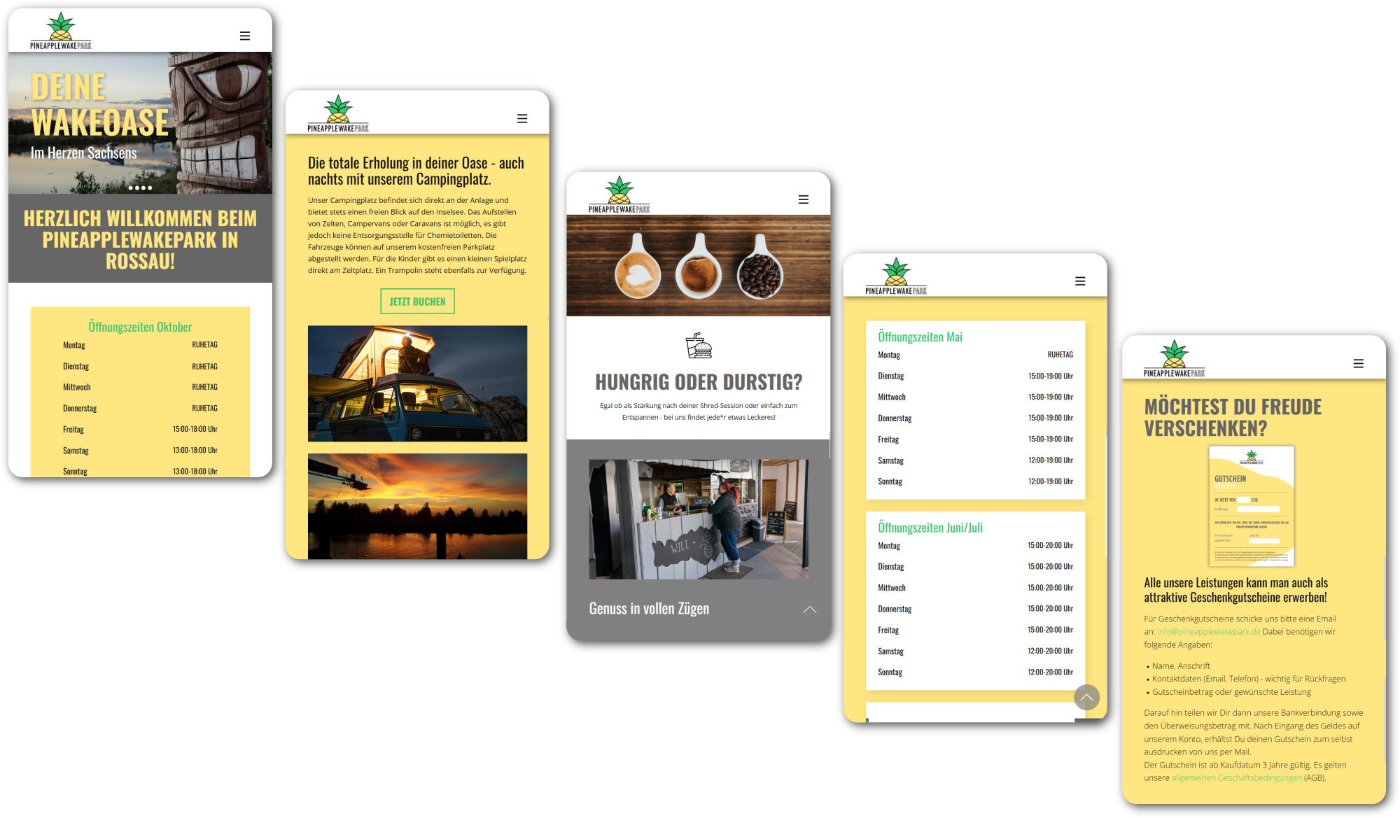
The design is of course responsive and behaves accordingly to the respective end device.
Thus, the space in the desktop version is largely used in a two-column format to transport information in a space-efficient manner.
Mobile
In the mobile version, on the other hand, the display is reduced to a single-column layout, which allows for better readability.
Merch
Lasercut Keychains
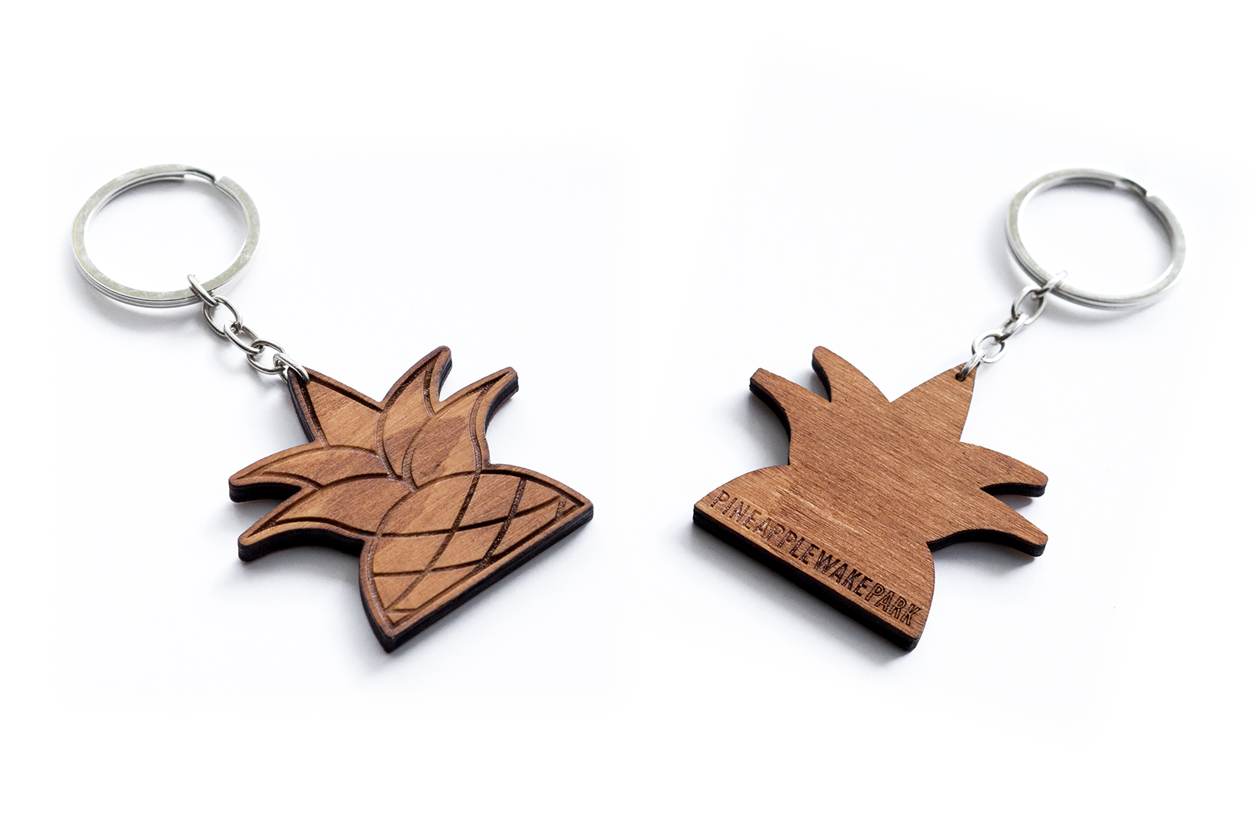
Pineapplewakepark also intends to offer the customer a choice in the merchandising sector. Logo and design of the brand can be found in different goodies.
As a souvenir for visitors to the park, I designed key rings with the logo's figurative mark. These were engraved in wood using a laser engraver and then cut out in the shape of the pineapple silhouette. To maintain the recognition value and to round off the design, the lettering of the logo was engraved on the back of the pendant. Subsequently, the pendants were hand-finished by me through adding weatherproof protective glaze and the attachment to key rings.
Wristbands
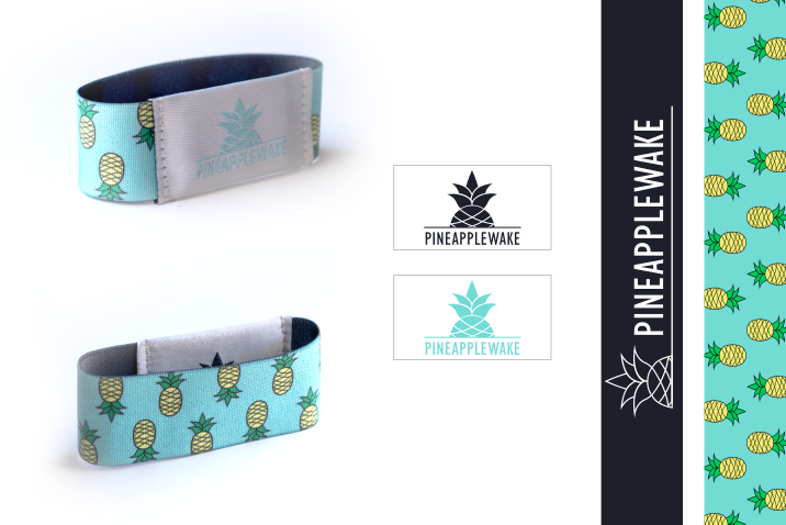
At the wake camps that Pineapplewakepark organizes, the riders are often at other water ski facilities that use an RFID chip system to log in at the ramp.
Here, the desire arose to distribute chip wristbands in a custom design to the participants so that they could take home a nice memory even after the camp was over.
As the most cost-effective solution, I developed a unisex chip band that can be worn in two different designs by turning it inside out. At the request of the customer, a playful design dominated by bright blue was to be seen on one side and a simple design with the main color black on the other.
This resulted in a patterned side that repetively uses the logo's figurative mark and a black side in which the overall logo itself forms the motif in contrasting white.
Teamshirts
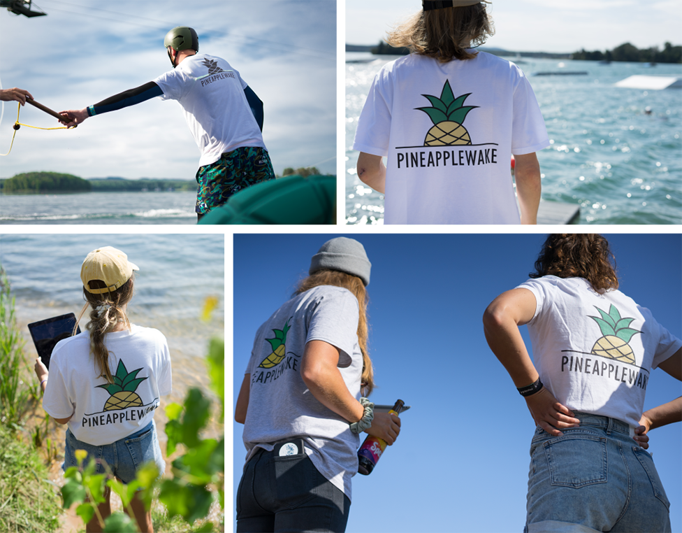
The logo was also used on textiles in its variations to offer recognizable shirts for the team, employees, customers and course participants.
Merchandise is available for purchase in the wakeparks on site store and soon online, too.
